“If the pigment content is so high, the paint flows quite differently. The trick is to get it to the point where you can even process it at all.” Helmuth Dengel
No effect on the interior temperature
There are also practical aspects. White suits any model, from small cars to luxury sedans. Chipping from stone impact, scratches and other defects are less noticeable. Dengel adds: “Compared to the typical forms of the eighties, white looks better on the beading and edges of today’s chassis contours.” A white car is cleaned less often.
People assume that the interior of a white car is cooler in the sun. Actually it’s no cooler than a black car. According to a study by the Touring Club Switzerland (TCS), the paint colour has no effect on how warm it’s in the interior. However, the body of a black car will really get hotter faster than a white car body.
Presumably that is why white is so popular in hot countries, including Spain. “Besides black and red, white is our most important colour,” says Montse Lopez, who as a sales expert in Dosrius, knows exactly what customers want. Customers include Daimler, VW, Seat, Nissan and their suppliers of plastic add-on parts. Minor requests for service or adjustment work are handled by the nine employees in Dosrius. When it comes to larger orders or modifications, the experts in Stuttgart are involved.
Colour impressions are subjective
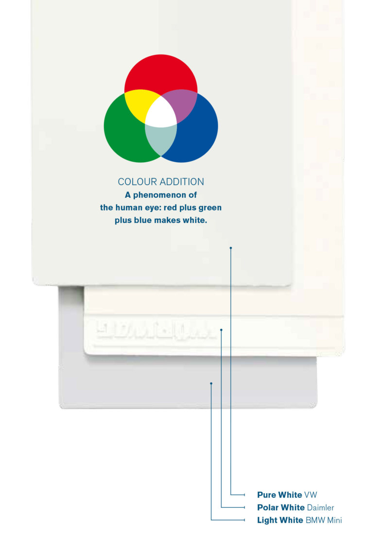
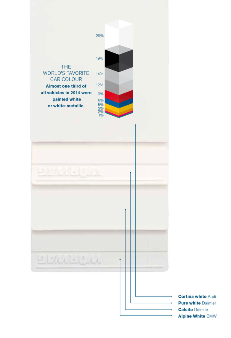
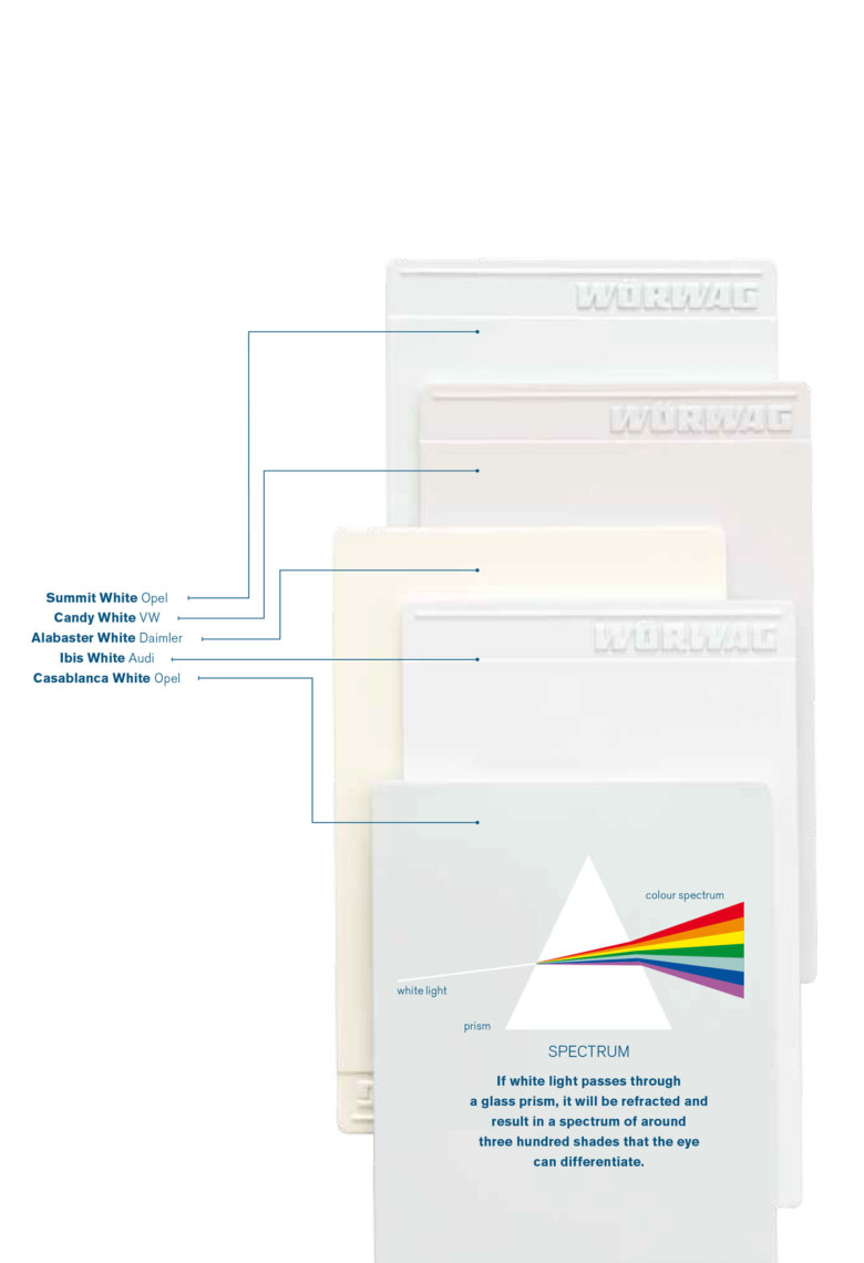
What is important in the development of a white vehicle paint? “White is not just white,” says Herbert Kost, Director of Design and Pigments. “Yellowish white looks old, and some find it ugly. If it has a blue tinge and radiates, then most people are won over.” And what one person perceives as gray, still appears as white to another. There are no clear criteria of when white is still white. The subjective colour impression is decisive.
Customer demands have increased in recent years. Metallic paints and pearl effects have displaced solid colours, and multi-layered structures pose some tricky tasks for developers. After all, it’s not just about the right colour, the process reliability in the series is also vital. Spot-repairs directly on cars and new application methods are other aspects that need to be taken into account during the early stages of development.

On a white mission: Herbert Kost, Armin Lechner and Helmuth Dengel (from left).
One real sticking point is opacity. Unlike other paints, white contains only one pigment, so the name of the game is: add titanium dioxide until you reach opacity. The white pigment portion can be as high as thirty percent.
That is a much higher figure than for other paints. But Dengel knows that this means other problems: “If the pigment content is so high, the paint flows quite differently. The trick is to get it to the point where you can even process it at all.” Among other things, one must know the proper technique for wetting of the pigment.
Antonio Valverde, who is responsible for colour design and development at Wörwag in Spain, knows that the smallest differences are already decisive. “Sometimes bodywork and plastic parts, which are painted in the same shade of colour, differ optically from each other,” says Valverde. “Such disharmonious results are often rejected by the customer, even though we have actually strictly followed their criteria.”
Research on behalf of customers
Developing white paints ready for series production is an equation with many unknowns. In a two-year research project on behalf of Daimler AG, Wörwag identified which shade of white can be used on both plastic and metal body parts to produce the maximum brightness with a single application. The answer is Moonstone white. “But if you go to the designer with that proposal, he will reject it because it’s too dark,” reports Armin Lechner of the development team for Uniand Premium Colours.
“The production department, however, is excited because they can process it and it’s stable.”
As a compromise, Daimler chose Diamond white for the series. Since the proportion of opaque pigment is extremely high here, special effects and colour pigments cannot be mixed in a single paint layer. They have to be layered successively. Another requirement, which set limits for developers, was a primerless coating process. A so-called compact or integrated paint process, (IPP) has long been standard in the automotive industry.
However: “If I drop the primer, the body is missing an important sunscreen, which the white layer will now have to provide as well,” says Lechner. It does not always have to be white. For his own car and leisure gear, Dengel has opted for a contrast. The team leader regularly plays piano and bass guitar in a band. Both are painted matt black. Dengel: “Colour is emotion.” And the trend for him on stage is definitely away from white.

A BYK-mac-i for analysis
The “BYK-mac-i” spectrophotometer is used regularly in the development and tinting of colours. It irradiates the surface to be measured with a series of bands of light that cover the entire spectrum, and measures the re-emission from each band. Solid colours are measured at an angle of 45-degrees. Four additional angles are required for special effect paints. Each measurement gives a point which can be situated in the so-called CIELab colour space. These are plotted on three axes: red-green, blue-yellow, and the vertical luminance or simply L-axis with the endpoints white and black. The developer can thus compare the co-ordinates measured with those specified to determine whether the hue is within the accepted tolerance.

Der CIELab colour space
The International Commission on Illumination CIE (Commission Internationale de l’Eclairage) published the LAB colour model in 1976. Its predecessor dates back to the thirties. It is based on human perception and is independent of the production or reproduction technology used.
* Since 1976, these stars have indicated the CIELab colour model. It’s designed to make a distinction between this model and its predecessor, the Lab colour space.
“Cream is for your second wedding”

is a writer, blogger, philosopher and literary critic. Tingler studied economics and philosophy at the University of St. Gallen, the London School of Economics and the University of Zurich. He also worked at the Economic Institute of the Federal Institute of Technology Zurich. He lives in Zurich.
www.philipptingler.com
Is white your favorite colour?
Certainly not. There are many situations when I think white is awful.
To be so vehement, you have to actually be quite fond of the colour, don’t you?
I do confess, white is rather sophisticated. In fact, it’s one of the most difficult colours, although people think the opposite is true.
Are there any white objects that you like?
Oh many. For example, I like white porcelain best, without decoration.
When don’t you like white?
Colour theory says: light colours broaden. Therefore, one must be careful with white pants or even skirts, unless you are very slim. A man’s wardrobe should only include white t-shirts, dress shirts and dinner jackets for cruises and outdoor occasions. And of course the proverbial white waistcoat to go with tails. Because of rule number one, in particular: no white belts. That is true for all genders and ages. Unless you’re younger than ten.
What colour is your car?
In the registration documents it’s “metallic blue”. I didn’t actually pick the colour, it came with the car: A Mercedes R107 from 1980. But the colour is a good fit for the car.
Where do you have white in your home?
On the walls, for example. Then the Kurland porcelain. The Saarinen chairs plus table are also white. How do you explain to a bride that white is an unflattering colour for her dress. White expands. Every bride should keep that in mind. Eggshell can already make a big difference. But avoid cream. That’s for your second wedding.
What goes through your head when a white car pulls up beside you at the traffic light?
“Not again!” Unless it’s a Rolls-Royce Phantom. Then I think: “Hello, Kanye!”
Why is white so popular for cars?
White has the image of being classless. And according to conventional colour psychology it’s also deemed to be discreet, sensitive and dutiful. Owners of white cars allegedly wash them more frequently and follow traffic laws. It doesn’t seem very cool. But in that vein, many choose white for safety reasons. Bright colours are more visible. I read on the Internet, that if you want to go for the safest colour, buy a mint green car. Well, unfortunately, we no longer live in 1985. Or perhaps fortunately.
What colour suit goes with which vehicle? And why?
Here we could take the three most important rules of wardrobe wisdom and apply them to the road. So that would first mean: ladies and gentlemen over 35 need to be very careful with any shade of colour. This also applies to their choice of car. Brightly coloured cars suit young people. Secondly: forced concoctions that are intended to appear unconventional, are usually embarrassing, just like suits in dayglo colours. The automotive equivalent would be a pastel compact car. Or racing stripes on a French mini-van. Thirdly: overweight people are well-advised to wear muted colours. This rule, known as the Helmut Kohl principle, can also be directly applied to the automotive world. Larger vehicles look best in darker colours: anthracite, hunting green, marine blue. Light gray would be an extreme option.
What is the role of white in art?
It’s important. Besides gold and blue, white is one of the most prominent colours in art history. White symbolizes more than innocence. Ever since the rediscovery of the colourful splendor of ancient temples, which were, mind you, just as brightly painted as their sculptures, white has been associated with the Enlightenment values: Equality, justice and reason. So it’s a very virtuous and rational colour.
And finally: What, then, is your favorite colour?
Medium beige.
Text: Michael Thiem
Photos: José Carlos Zarcero, Frederik Laux


